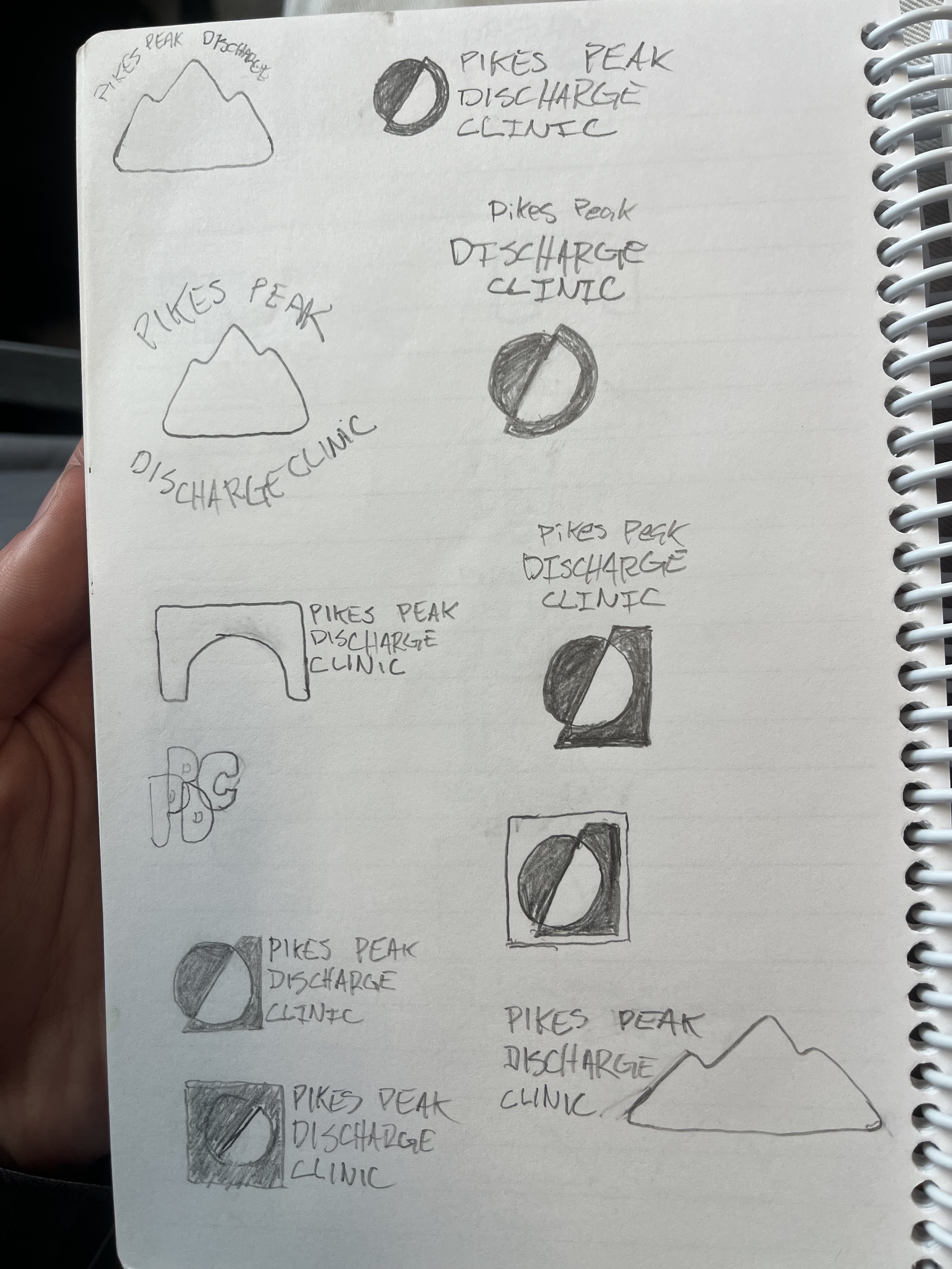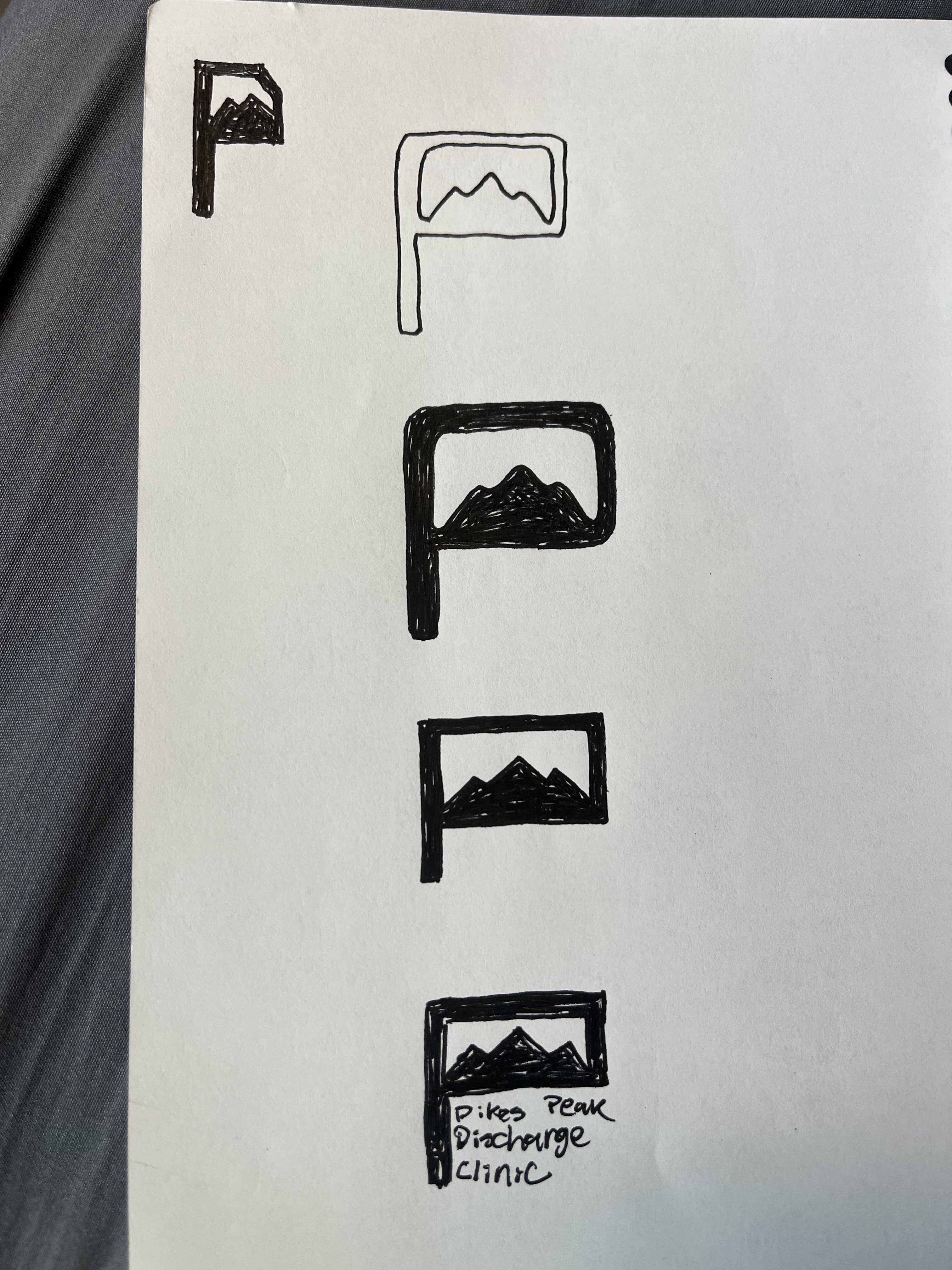


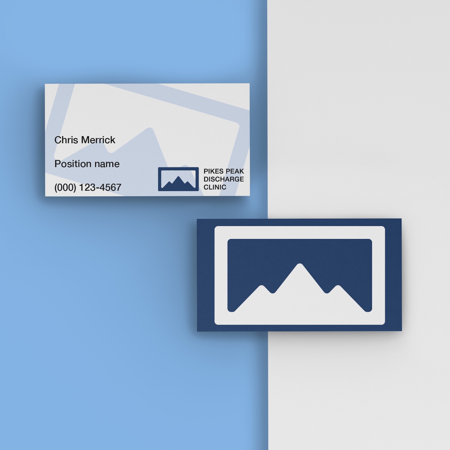

I was reached out to by the co-owner of Pikes Peak Discharge Clinic to design a logo and some branding elements for the new medical business based in Colorado Springs. They wanted to come across as professional and trustworthy while also appealing to the local population.
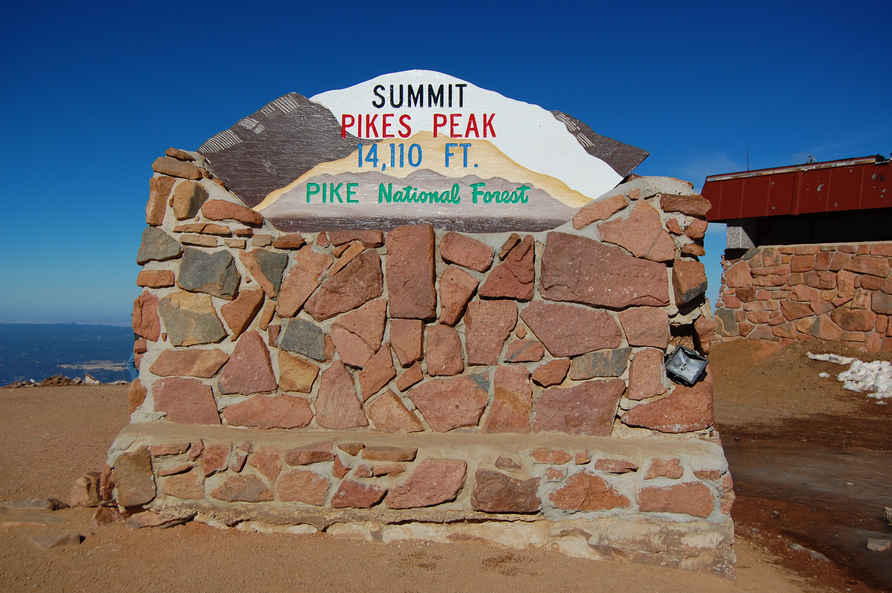
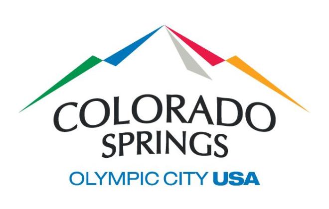
As I thumbnailed designs, I kept coming back to mountain imagery. Even though it was a medical company, the location being in the name seemed like a good reason to make a mark that references back to this. In addition, they wanted people to feel comfortable with the company, so I hoped the design would remind them of their home in Colorado Springs. I came up with a clean and minimal design based on the actual Pikes Peak mountain and the Colorado Springs government website logo, with a logo depicting a mountain with three peaks. I boxed it all in because squares historically have been used to represent stability.
I chose two shades of blue for their primary colors, as blue is known to evoke feelings of trust. I chose a green and a brown as secondary colors to further the theme of the mountain. I chose Helvetica as the main typeface due to its frequent use in the medical industry. In addition to branding elements, I created mockups for business cards and a professional polo.
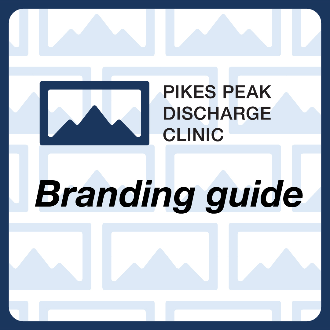
More details about the branding are in the branding guide pdf above.