


For my Intermediate Graphic Design class, I and two other designers were tasked with redesigning a popular company, and my group chose to redesign BIC. BIC has had the same logo since 1961, so we wanted to modernize the branding of the company while staying true to its style.
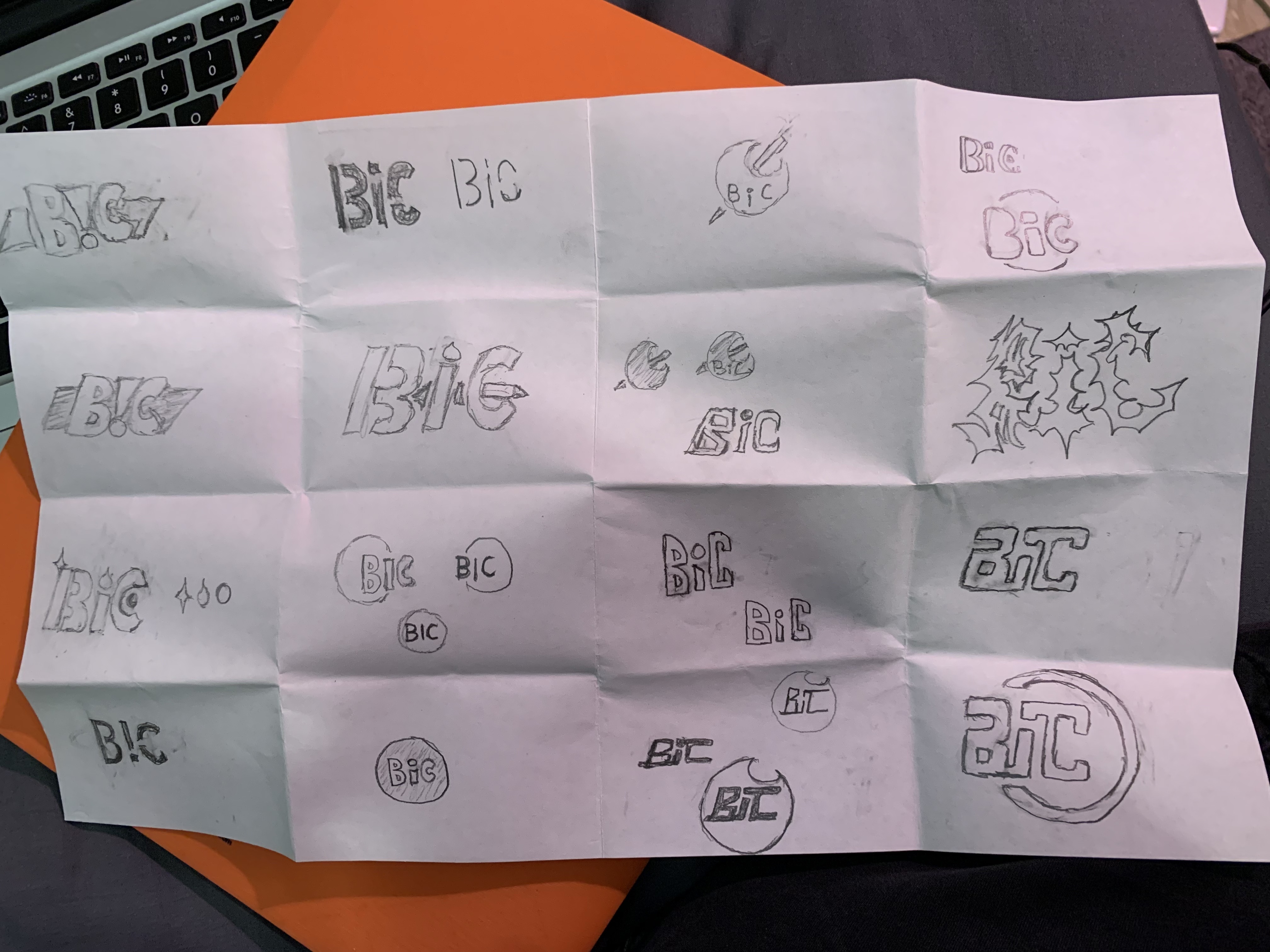
Myself and two other designers came up with several ideas and made dozens of thumbnails. Most of our designs included the iconic pen, and decided to go forward with this idea. After we each rendered our best ideas, one of the logos I designed became our final choice due to its modern simplicity while still being recognisable. The logo is pictured in the first image.
It is a very simple design that depicts the letters with the iconic BIC Cristal Pen. The “I” also doubles as an exclamation mark to give the idea that, in spite of it being a stationary company, their products can be exciting to use.
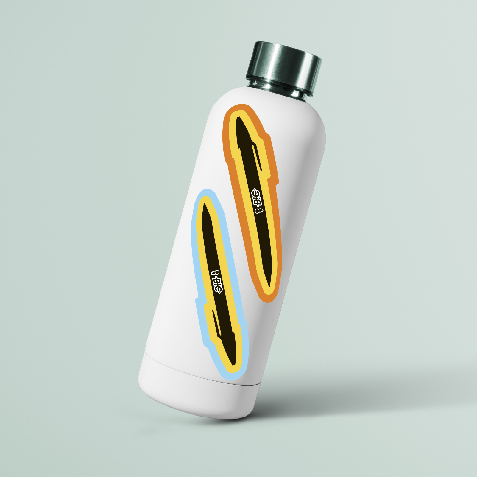
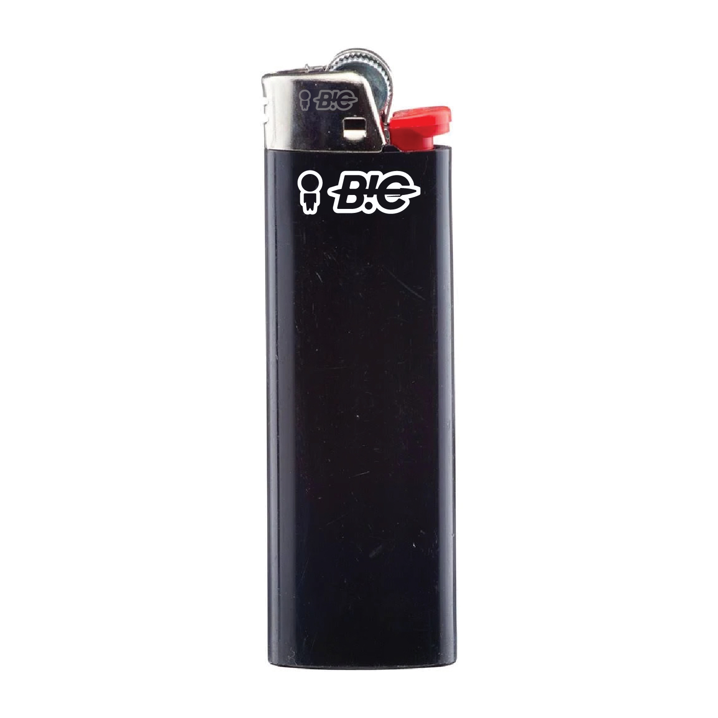
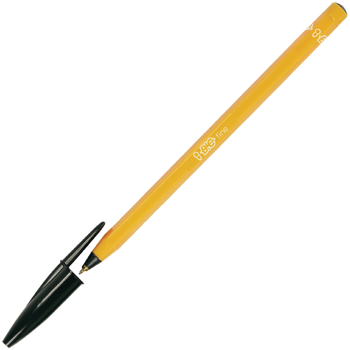
In addition to the logo, I created mockups, advertisements, and sticker designs. The colors and other branding elements were chosen by my other teammates.